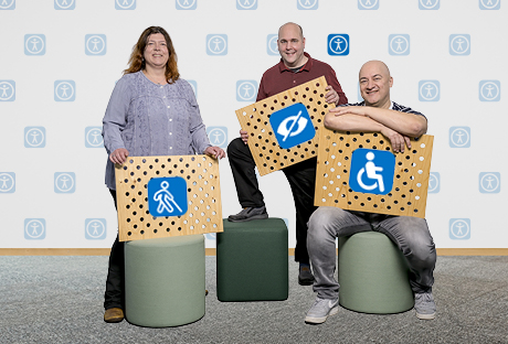
Accessibility benefits everyone
In case you are wondering whether people with disabilities use computers and the internet, the answer is yes!
In fact, people with disabilities use the internet more often than average, as digital services increase their autonomy and independence. These services include public transport timetables, online shopping, information about degree courses, online banking and social discussions. People with disabilities study and work. When they are able to use the assistive technologies that are important to them, their performance and engagement is no different than that of people without disabilities.
Thanks to special hardware and software, people with disabilities can move independently in digital spaces, get information, and study or work. The range of available assistive technologies is broad: special input and pointing devices, screen magnification, text to speech programmes, Braille displays and screen rulers are just a few of them. Making ETH Zurich accessible to everyone as a place to work and study requires barrier-free services. Accessible digital interfaces are also easier to use for everyone and can be used regardless of the device. This results in lower support and maintenance costs over the long run.
Barrier-free communication – sub-project 11 of the «Barrier-free ETH programme»
People with disabilities are part of our society, including our academic society. ETH Zurich wants to be accessible to everyone as a place to work and study. This requires barrier-free services.
With the sub-project barrier-free communication (TP11), we (CC, ITS and Campus Services) are working together towards the goal of making ETH’s digital offerings as accessible as possible. We are revising ETH Zurich’s most frequently used, central communication channels and web platforms based on the Web Content Accessibility Guidelines (WCAG).
Barriers in the digital space
People with disabilities encounter a variety of barriers:
- Visual barriers:
- no alternatives for visually conveyed information e.g. content of graphics, video tutorials
- Poor colour contrasts
- Auditory barriers:
- no alternatives for spoken information, e.g. testimonials as mp3 files, podcasts
- Language that is too complex: sign language, the native language of many deaf people, functions quite differently from spoken and written language. Spoken and written language can thus be a difficult foreign language for many deaf people.
- Motor barriers:
- poor keyboard operability, e.g. buttons or navigation that can only be operated with a mouse. Not all users can operate a mouse (amputations, diseases, paralysis, tremor, etc.) or see the cursor (blind, severely visually impaired). A significant number of assistive technologies and tools use the keyboard interface. They work well when keyboard operability is ensured.
- Cognitive and neurological barriers
- Moving objects, e.g. news ticker, endlessly looping animations
- Complexity in language and structure
Digital services are always an interplay of design, programming and web editing. All three play a part in breaking down barriers or preventing them from arising in the first place. A few examples:
- In design, for example, attention must be paid to minimum contrast requirements so that people who are colour blind can also perceive all content. It also ensures that no information is conveyed exclusively through colour.
- In programming, for example, the operability of interactive elements must ensure that buttons, dropdowns, filters, etc. can be used with keyboards without a mouse. It also ensures that screen reader users receive all the information that is also available to sighted people.
- Web editors are responsible for content accessibility: they position headings correctly, write alternative texts for images, publish videos suitable for the visually and hearing impaired, and ensure that podcasts are also available as transcripts, among other things.
Golden rules for more accessibility
By taking the following rules to heart, we can all contribute to more accessibility in the digital space.
- Headings: Format headings as headings
- Lists: Format lists as lists
- Links: Write self-speaking links («Continue to login» instead of «Continue», «More about the Sign Language Interpreting Study Programme» instead of «Find out more»)
- Images: Evaluate your graphics: are they decorative or do they convey meaning?
- Decorative: mark them as «decorative»
- Convey meaning: Create an alternative text that essentially conveys the meaning of the graphic
- Colour: Make sure that the contrasts are sufficient. Don’t rely on colour alone to convey meaning
- Keyboard operability: Ensure keyboard operability.
- Focus visibility: Ensure focus visibility.
If you have already internalised these seven points, you can try the following ones:
- Informative texts: Ensure that text is understandable and informative (error messages, labels, instructions, information)
- Page title: Make sure that each web page has an informative, unique title. This information is the first to be transmitted to screen readers. Page titles also contain information about the page operator (in our case ETH).
- Blank lines: Avoid blank lines (use spacing formatting instead)
- Tables: Give tables a header (ideally two) and don’t use tables for layouting
- Generally:
- Pay attention to logically correct sequences and hierarchies
- Make it as clear as possible what kind of input is expected from users.
- Ensure that labels and instructions are always clear and visible.
- Explain any problem with incorrect entries in form fields and advise about important actions.
For those who would like to learn more about the topic, we recommend the Digital Accessibility Course as an introduction, as well as the following websites:
- Digital accessibility: Aids, tools, reading tips
- Making a webpage accessible
- Creating accessible documents
- Colour accessibility for web graphics
Also see ITS Blog post
«Implementing accessibility – challenges and obstacles«
Contact
- Christian Schär, Group Manager WCMS and Mobile Applications, (ITS APPS)
- Manu Heim, Project Manager Accessible Communication (ETH CC)

erstellt am
in News


