New Design for Login Page
ETH applications now also with new login design.
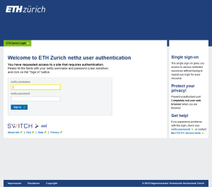
The new www.ethz.ch design is becoming increasingly visible. During the last few weeks, the IT Services (ITS) and Corporate Communications (HK) have been deliberating how to apply the design to ETH applications. The first visible result is the newly created login page.
ETH Zurich Login Page
Content remains unchanged, while «look & feel» are completely adapted to our home page. This includes the highly visible yellow focus frame which guides the eye to the corresponding input field and thus represents an important element in usability. The new design is now active on all web applications that log in via Shibboleth.
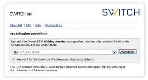
Organization Selection
On some web pages selection of organization appears prior to the login page. This connects to another company by the name of SWITCHaai. In the past this was not so noticeable since both designs were similar. Nowadays the difference is clearly visible and may sometimes give the impression that not all login sites have been changed. However, this is only to show us that we’re moving to an external web page, from which we could also login to another university.
Contact
IT Services at ETH Zurich, ITS Software Services (ITS SWS)
erstellt am
in News


